I have a theory, that's unproven so far, but it goes like this:
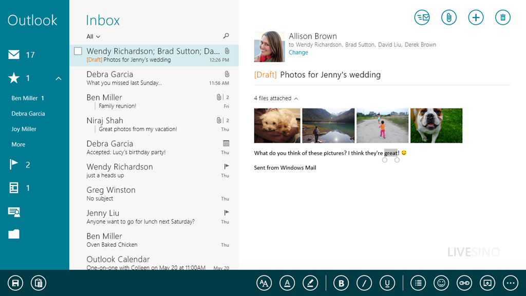
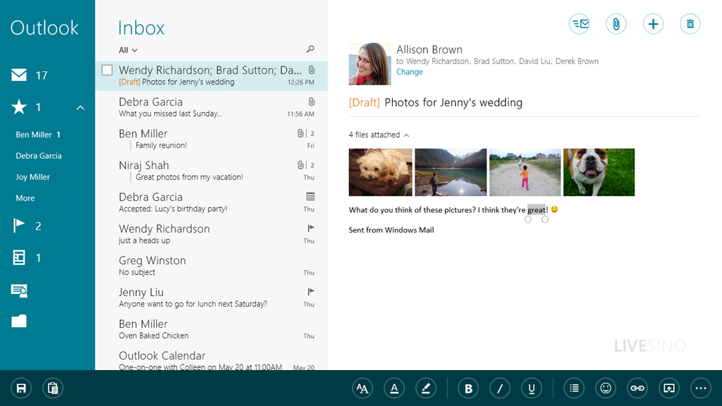
Thick and/or high-contrast borders around buttons (as a style) are wrong. And I think they are almost provably wrong. I'll explain why I believe this to be true in a moment. For clarity, I'm talking about buttons like the circle-bordered icons appearing in the top right and the bottom of the following screenshot:
Thick and/or high-contrast borders around buttons (as a style) are wrong. And I think they are almost provably wrong. I'll explain why I believe this to be true in a moment. For clarity, I'm talking about buttons like the circle-bordered icons appearing in the top right and the bottom of the following screenshot:
Here's the theory:
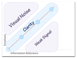
Thick and/or high contrast borders fall into the visual noise portion of this chart:
- The similar round border on all the icons makes the overall shape harder to distinguish using the parallel visual search processes in your brain (e.g., it's hard to instantly spot the icon you want if it's in your peripheral vision). That means you need to use serial search processes to find the icon you need, which means more time spent searching and a higher cognitive load.
- Thick and/or high-contrast graphic elements fight for your visual attention. To see the actual differentiating features of the button (e.g., the actual icon inside the thick high contrast circle), your brain needs to create a sort of temporary visual filter to ignore that which you would normally be paying attention to. This means more time spent learning what each icon does.
Thick and/or high contrast borders fall into the visual noise portion of this chart:
To prove that thick and/or high contrast borders are wrong, we need to agree on a criteria for deciding value.
The purpose of a button is often to be clicked. Two properties impact ease of clickability: button size and findability (e.g., how easy it is to find the button when you're looking for it). All these buttons have the same size, so we can eliminate that as a candidate for a judging criteria. That leaves us with findability.
So to prove that thick and/or high contrast borders are wrong, we need a test to measure how easy it is to find and click on these buttons.
I propose an online test that starts like this:

The initial click gets your mouse in the center position. When the Go button is clicked, an arrangement of icons are randomly placed around the edge, along with a target icon in the middle, like this:
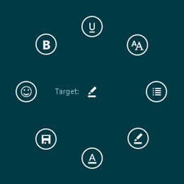
The test subject then visually scans the buttons to find the target and click it. From the moment the Go button is clicked, the test records mouse movements over time, click time, and the angle/position of the button the subject clicked. If the user clicks the wrong button that too is recorded. After any button (correct or incorrect) is clicked, the test resets, and looks like this:

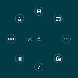
When the Go button is clicked, we repeat, although this time we use a randomly-arranged set of buttons with a redesigned border (e.g., thinner and/or lower contrast), like this:
And we continue to measure the results, recording with each test whether all the buttons presented had thick high-contrast borders or thin low-contrast borders.
And who knows? With sufficient data we may be able to convince designers to change their button borders to something that looks more like this:
And who knows? With sufficient data we may be able to convince designers to change their button borders to something that looks more like this:
I imagine a website where it's easy to setup tests like this and collect the results from designers and developers interested in researching great UI (where test results are freely available).
What do you think? Know of a site where we can setup this test? Want to help create this?
What do you think? Know of a site where we can setup this test? Want to help create this?
 RSS Feed