Science of Great UI
  • Home
  • Research
  • Contact

How the Science of Great Design Could Have Saved the Oscars

2/28/2017

1 Comment

 
On February 26, 2017, 32.9 million viewers watched one of the biggest blunders in Oscar history, as Warren Beatty and Faye Dunaway presented the Oscar for Best Picture to La La Land, even though the actual winner was Moonlight.
Picture
How did this happen, and how could the Science of Great Design have prevented this snafu at the Oscars?

​First, the timeline of events (Pacific Standard Time):

8:50pm 
PwC accountants Brian Cullinan and Martha Ruiz, each with an identical set of envelopes, are positioned at opposite wings in the theater (since they don't know in advance from which side the presenters will enter).

8:51pm Ruiz hands her Best Actress envelope to Leonardo Dicaprio. Cullinan fails to dispose of his duplicate copy.

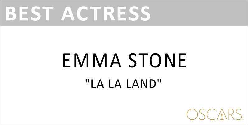
8:57pm Actress Emma Stone completes her acceptance award and walks offstage. The Oscars go to a commercial break.

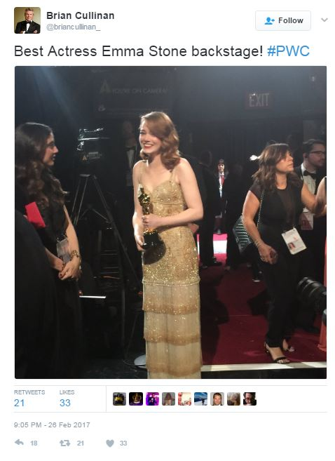
8:58pm-9:04pm Timing is unclear, but somewhere in this time Cullinan takes a picture of Emma Stone holding her freshly-awarded Oscar:
Picture
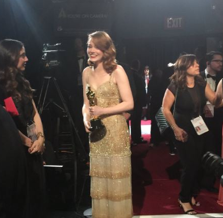
The picture is taken backstage, lights are relatively bright and people appear to be in motion, so it seems likely the picture was taken during the commercial break (before Best Picture is announced).

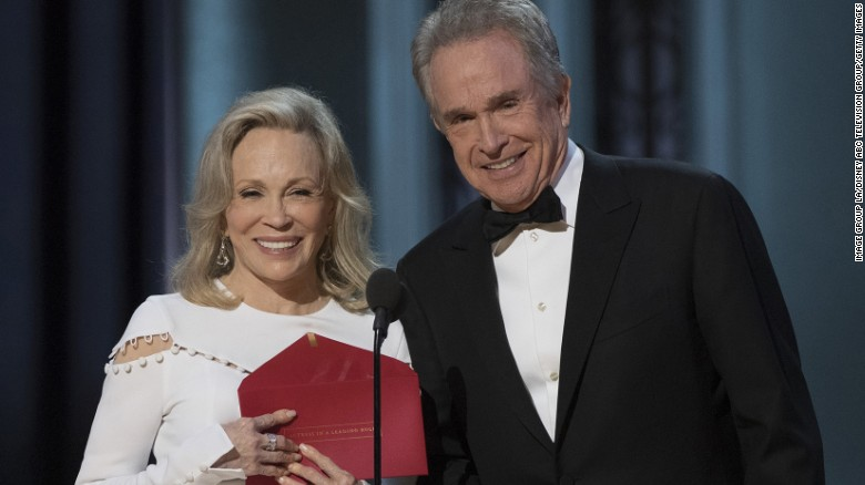
9:00pm Cullinan mistakenly hands the Best Actress envelope to Warren Beatty (no doubt believing it was the Best Picture envelope).
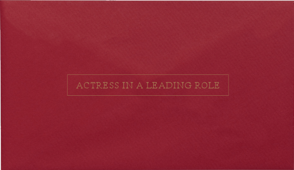
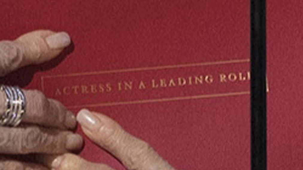
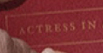
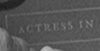
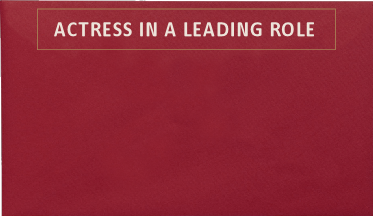
Picture
9:01pm ​Beatty and Dunaway start their presentation. If you look closely at the photo below, you can make out the text on the envelope reading "ACTRESS IN A LEADING ROLE".
Picture
Here's a magnification of the envelope:
Picture
Beatty and Dunaway are holding the wrong envelope, but because the envelope is labeled on just one side, only the audience of 39.2 million viewers has a chance of seeing it.

​9:05pm Cullinan tweets his photo of Emma Stone (his tweet has since been deleted).
Picture
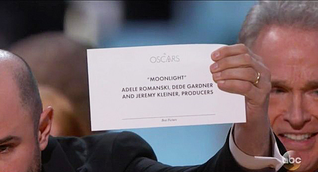
9:05pm Beatty opens the envelope, and appears somewhat taken aback when he sees the following card:
Picture
9:05pm Beatty does not read the card aloud. Dunaway thinks Beatty is joking. Clearly confused, Beatty tilts the card toward Dunaway so she can see it. She spots the words "LA LA LAND" on the moving card and immediately blurts out those words.
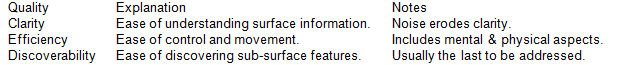
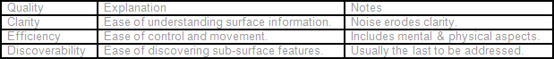
So, how could the Science of Great Design solve all of this? There are four areas:

1. Inattentional blindness, caused by stress and an increase in cognitive load, decreases our situational awareness. The higher the stress or cognitive load, the narrower our awareness. You can impair your situational awareness by performing even the smallest mental exercise, such as doing mental math or using the voice interface inside a car while driving.

Cullinan, tasked with the already-stressful job of handing out envelopes without error, appears to have taken & tweeted the picture of Emma Stone only moments before Beatty appeared with the wrong card. The simple act of thinking about the tweet you're going to send during the upcoming commercial break, is enough to reduce our situational awareness. It's called inattentional blindness, and here's a video showing how easy it is to experience this cognitive tunneling:
When crucial, mission-critical tasks must be performed without error, it is important to give operators as much situational awareness as possible. That means a clear presentation of information with no distractions. In this case, the two separate tasks of handing out poorly marked envelopes in dim light and tweeting photos of winners, need to be performed by two different people.

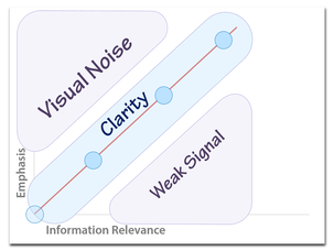
2. Emphasis must match information relevance. This is one of the core guidelines in the Science of Great Design. The more important the information, the greater the emphasis. You can emphasize with size & contrast, among a host of other techniques. Here's the card Beatty and Dunaway saw:
Picture
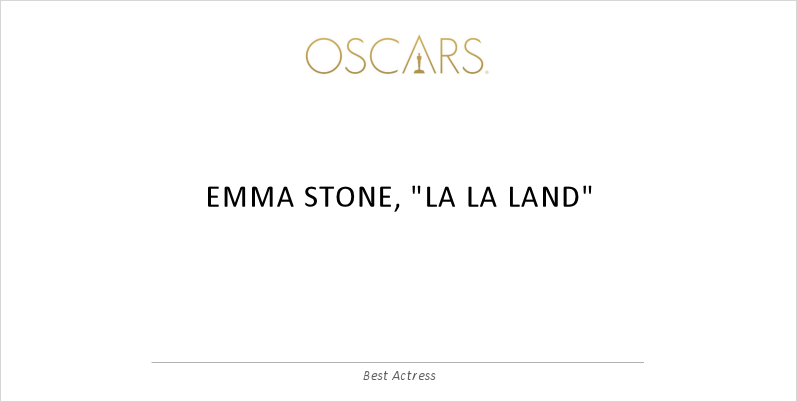
On any given Oscar card, the most important information is arguably the winner's name. The movie title is less important (unless you're talking best picture category). On the card above, both the winner's name and the movie are rendered in a bold, high-contrast stroke, but they are both of equal visual weight. However there's another piece of crucial information - the words "Best Actress", rendered in small italic gray text at the bottom center of the card:
Picture
The category, being at the bottom of the card and so small, will be literally the last thing you read.

The fix is to apply the 
emphasis must match information relevance guideline, and for this card, could look like this:
Picture
3. To make text easy to read, the contrast ratio (of text to background on the perceived brightness spectrum - gray scale) needs to be pretty high - at least 7:1. If reading takes place in low light (such as in the wings backstage at the Academy Awards), then the contrast ratio needs to be even higher. As an example, black text on a white background has a contrast ratio of about 21:1. But the contrast ratio for the gold "ACTRESS IN A LEADING ROLE" text on the dark red background is less than 2:1, far below the minimum for easy readability.
Picture
Picture
The fix is to increase contrast. Brighten the text and darken the envelope. You can also make low-contrast text easier to read by increasing the font size.

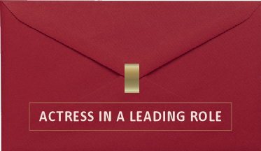
4. Discoverability helps users understand what to do and where they are. It is important for signposts to be positioned along the path where they are likely to be easily seen. In the case of this particular event, the important signposting that could have prevented this were the words "ACTRESS IN A LEADING ROLE" printed on the front of the envelope. There are two problems with this signposting. First, it's in a location where it's unlikely to be easily seen. The words are on the front of the envelope, but the backside of the envelope faces you when you open it. Second, the "ACTRESS IN A LEADING ROLE" words are not easily seen because the text is relatively small, and as we've already seen, of insufficient contrast.


The fix is to increase the text size & the contrast, and to add signposting to both sides of the envelope, like this:
Picture
Picture
So, the four fixes to save the Oscars (in future years) are:
​
  1. One person hands out the envelopes. One person tweets photos of the stars.
  2. Increase the size and contrast of the award category text (e.g., "Best Actress") on the cards.
  3. Darken the envelopes, brighten the award category text, and use a larger font.
  4. Print the award category label on both sides of the envelope.

Understanding the relationship between cognitive science and good design is important. It can save money, save time, and might even save you from making embarrassing mistakes.

To learn more about the science behind great design and user interfaces (UI), check out my course, the Science of Great UI, at deviq.com/sgui.
1 Comment

Are Thick High-contrast Borders Wrong?

4/24/2015

2 Comments

 
I have a theory, that's unproven so far, but it goes like this:

Thick and/or high-contrast borders around buttons (as a style) are wrong. And I think they are almost provably wrong. I'll explain why I believe this to be true in a moment. For clarity, I'm talking about buttons like the circle-bordered icons appearing in the top right and the bottom of the following screenshot:
Picture
Here's the theory:

  1. The similar round border on all the icons makes the overall shape harder to distinguish using the parallel visual search processes in your brain (e.g., it's hard to instantly spot the icon you want if it's in your peripheral vision). That means you need to use serial search processes to find the icon you need, which means more time spent searching and a higher cognitive load.
  2. Thick and/or high-contrast graphic elements fight for your visual attention. To see the actual differentiating features of the button (e.g., the actual icon inside the thick high contrast circle), your brain needs to create a sort of temporary visual filter to ignore that which you would normally be paying attention to.  This means more time spent learning what each icon does.

Thick and/or high contrast borders fall into the visual noise portion of this chart:
Picture
To prove that thick and/or high contrast borders are wrong, we need to agree on a criteria for deciding value. 

The purpose of a button is often to be clicked. Two properties impact ease of clickability: button size and findability (e.g., how easy it is to find the button when you're looking for it). All these buttons have the same size, so we can eliminate that as a candidate for a judging criteria. That leaves us with findability.

So to prove that thick and/or high contrast borders are wrong, we need a test to measure how easy it is to find and click on these buttons.

I propose an online test that starts like this:
Picture
The initial click gets your mouse in the center position. When the Go button is clicked, an arrangement of icons are randomly placed around the edge, along with a target icon in the middle, like this:
Picture
The test subject then visually scans the buttons to find the target and click it. From the moment the Go button is clicked, the test records mouse movements over time, click time, and the angle/position of the button the subject clicked. If the user clicks the wrong button that too is recorded. After any button (correct or incorrect) is clicked, the test resets, and looks like this:
Picture
When the Go button is clicked, we repeat, although this time we use a randomly-arranged set of buttons with a redesigned border (e.g., thinner and/or lower contrast), like this:
Picture
And we continue to measure the results, recording with each test whether all the buttons presented had thick high-contrast borders or thin low-contrast borders.

And who knows? With sufficient data we may be able to convince designers to change their button borders to something that looks more like this:
Picture
I imagine a website where it's easy to setup tests like this and collect the results from designers and developers interested in researching great UI (where test results are freely available). 

What do you think? Know of a site where we can setup this test? Want to help create this?
2 Comments

Great UI, Clarity, and Information Relevance

2/11/2009

2 Comments

 
Let's create a 3x4 table in word....
Picture
And let's fill the table with data....
Picture
Now, at this point, we might pause to ask "What's wrong?". But before we answer, let's make the observation that in the table above, there are a number of graphic elements working together to convey information. There is the data, rendered as text:
Picture
And there are lines separating the data:
Picture
Note that in Word, both the lines separating the data, and the data itself, are both rendered with essentially the same visual weight. The thickness of the line matches the thickness of the strokes used to render the text, and the contrast of the lines also matches the contrast of the text.

However, it seems that the lines and the data, in terms of relevance to the viewer, are far from equal. A viewer is far more interested in the data than the lines separating the data.

Let's look at the same table in Excel:

Picture
Notice that when creating the same table inside Excel, something interesting has happened. The lines are rendered in a much lower contrast than the data itself.

Which table do you find easier to read?
Picture
On a whim, let's create a version of this table where we do the opposite of what's done in Excel. Namely, let's reduce the visual weight of the important data, while increasing the visual weight of the much less relevant separating lines:
Picture
How easy is this to read, compared to the table from Microsoft Excel, above?

So, two important points to take away:

  1. Not all information is equally relevant to the viewer.
  2. We have control over the degree to which we can emphasize information.


And from these two realizations, you can reach the third, perhaps most important guideline to achieving clarity in your UI:


Visual weight should match information relevance.

This guideline is incredibly important, easy to follow, and yet violated frequently. My contention, as set forth in the post that explored the question of why great UI was so hard to achieve, is that the rampant violations can be explained by a lack of training.

Here's a screenshot of Visual Basic source code as seen in Visual Studio 2008:
Picture
The horizontal lines carry little information relevance. And even though they are rendered above in a medium gray, their contrast and corresponding visual weight far outweigh their intended purpose.

Here's the same image with one minor change:
Picture
See how much easier it is to get your eyes into the relevant data.

Here's a screen shot from Adobe Lightroom:
Picture
Notice how the labels on the left, being less relevant than the data to their right, are rendered in a lower contrast, allowing your eyes to quickly get to the relevant information.

In near-future posts, we'll talk more about ways to control emphasis and dive deeper into clarity.
2 Comments

Why is Great UI so Hard to Achieve?

2/6/2009

0 Comments

 
Filling up my car with fuel this morning, I'm suddenly hit in the face with more evidence that the vast majority of user interfaces fail to satisfy those three important elements of great UI: clarity, efficiency, and discoverability.

One of the common mistakes you see in the physical world are buttons on a single device designed as if they will all be pressed with the same frequency. You can tell this because the buttons are all the same size, and in some cases the buttons you have to hit most frequently are two small and located in places that require more thought and more precision to hit than they should.

Speaking of buttons and precision, here's part of the interface I was looking at:

Picture
On the left you have the button from a fuel pump that selects the most popular grade of gasoline in the United States. On the right sits the button for the less popular, more expensive grade of petrol. The erosion on the left is like a chart showing both frequency of hits as well as signaling where people wanted to hit the button. It is clear that humans who interacted with the button on the left wanted to work with a button far larger than the designed "Push Here" area afforded.

Here's a redesign of this interface, keeping with the essence of the original:

Picture
Here are the changes (we'll explain the rationale behind these changes in future posts):

  • "GRADE SELECT" converted to the less-noisy "Grade Select".
  • The unnecessary underline below "Grade Select" has been removed.
  • The redundant "Grade Select" text has been removed.
  • The tabs holding the "Grade Select" text have been removed.
  • Button area increased and low-contrast border added.
  • Contrast of the "Push Here" labels has been lowered.
  • Contrast between the Regular and Plus text, and their backgrounds has been increased.


So, while there is plenty of evidence that some buttons are pressed more than others, there isn't much evidence that designers actually understand that.

One of my favorite large buttons is the space bar on a modern keyboard. Of course that originates from an ancient machine known as the typewriter. Unfortunately, the QWERTY layout that dominates today takes a step far, far away from efficiency by unbelievably moving frequently-accessed keys into harder to reach spots, reportedly because early adopters of typewriters with pre-QWERTY layouts were so proficient they would frequently jam the typebars of the machine together. I can't tell you how much I would like to be in on that meeting back in 1874 when they decided to move the keys around so they were actually harder to hit. That one decision had to be one of the most expensive user interface mistakes ever made, in terms of lost productivity multiplied over time. That space bar likely survived only because hitting it simply advanced the paper one character to the left -- and did not increase the risk of typebars getting wedged together.

But it did survive and it's big and easy to hit with either thumb, so I like it. :-)

You need to get to that cross walk over there in the distance on the right. Which path do you take?

Picture
To the left, the designers' intention is highlighted in red, and to the right, the more efficient path is outlined in blue:

Picture
There is evidence humans prefer efficiency to flat hard ground.

You're watching TV. You need to change the channel, and you need to change the volume.

Which remote control would you rather hold in your hand?

Picture
Which remote would you rather adjust volume on?
Picture
On the white remote control on the right, the channel-changing buttons on top are far away from the volume-changing buttons at the lower-right.
Picture
Also, these horizontal and vertical orientations are inconsistent and require some mental training before it feels natural. And the visual weight(shape, size, contrast) of these buttons is identical to nearly all the other buttons on the control, including the rarely-pressed buttons labeledLanguage and Clock.

You're inside an elevator in the N-terminal at Seatac airport. You need to get on your plane. There are three buttons to select your destination:

  • CONCOURSE (CC)
  • RAMP (*R)
  • TRAIN (TRN)
Picture
Which button do you press? That RAMP button with the star next to it looks mighty appealing. After all, I must walk down a ramp to get onto my plane. And haven't I seen stars on elevator buttons used to indicate the main floor or lobby? And what's a concourse, anyway? I need to get to my gate, and it's in a terminal.

Here's a wider picture of that elevator control panel:

Picture
Apparently there was sufficient ambiguity between the RAMP level (some obscure mid-level where passengers apparently do not want to be) and the CONCOURSE level (where you can board your plane) to justify the addition of the hardware-equivalent of software's floating tool tips. Of course, these tool tips are completely invisible to blind folks who are likely to all be congregating on that floor marked with the star R on it.

So, there is evidence that designers of hardware (and certainly software) are not paying attention to important matters.

Now back to the original question -- why is great UI so hard to achieve? While a number of factors impact the ultimate outcome, I would suggest the most important influencer is training. It seems that most developers and designers creating interfaces for human consumption simply lack a small bit of knowledge that could make a huge difference.

How big of a difference? Well, for starters, let's go back to the gas station where I bought fuel this morning. Swiping my credit card, I'm presented with a message on screen, that looks like this:

Is this a debit card?

Of course I am unable to proceed until the question is answered. I happen to be using a credit card, not a debit card, so I know the answer isno. However it is not immediately clear how I'm supposed to communicate this status to the machine.

So next I move my gaze down to scan the keypad. After reading labels on a half-dozen buttons, I find the buttons labeled Yes and No at thebottom-right of the keypad (much farther away from the message than they need to be). I should point out that the question (e.g., "debit card?") changes from station to station -- sometimes the machine wants to know if I'm using a credit card, and sometimes the machine asks me to find buttons labeled Credit and Debit and then press the right one. Remembering that the question this time was asking if I was using adebit card, I click the No button, and return my gaze to the screen above, to see if I am now permitted to put fuel in my vehicle.

All told, this sucks up about ten seconds of life each time I use my card. And not only at gas stations, but grocery stores and many other places of business. Every time I try to give my money to the merchants, they just try to slow me down. This is not in their best interest, nor is it in mine.

Poorly-designed UI acts as a frictional force against the economy. How much does it cost? Well, let's start multiplying those ten seconds out across all the millions of transactions occurring every day across all of these machines, and you have a picture of an amazing amount of time wasted. Multiply that time by average salary of those affected and you have a way to estimate the cost of this design choice.

But why ask the debit card question in the first place? Personally, I never carry any debit cards. For me, the answer will always be the same. Well, it would always be the same if the questions were always the same. And surely we live in a world where technology can identify on some end (the gas station, the bank, etc) which way my card swings.

So, bad UI surrounds and the reason for this failure may simply be lack of training. And I'm betting when you first saw the question you were thinking it was something else. :-)

The test for this assertion is simple. Follow the series, get the training, and watch how dramatically that improves your ability to design great interfaces.

In the next post, we'll dive into clarity.

0 Comments

The Essence of Great UI - An Overview

2/5/2009

0 Comments

 
I've decided to spend some time doing a brain dump of everything I know about great user experiences. Here's the first of what I hope will be a fun and inspiring journey. I also expect this series will serve as a replacement for the book on great UI that I'm unlikely to ever write....

The most important thing to start with is the knowledge that great UI is all about three things:

  • Clarity
  • Efficiency
  • Discoverability

Clarity 
is the ease of understanding presented information.

Efficiency is the ease of control and movement through the data. There are obvious physical components to this, and there are not-so-obvious mental components as well.

Discoverability is the ease of finding and understanding that which lies below the surface.

So the challenge to creating a great UI is to maximize all three of these. However, this is rarely easy to do, as there are many paths we might take, and natural tensions that exist along those paths.

In future posts, I'll show how to measure efficiency, clarity, and discoverability, and talk about interesting ways we can improve these elements of the user experience. And as always, I encourage interaction and ideas from you. Feel free to post a comment below, or contact me directly.

No series on great UI would be complete without a discussion about the value of great UI. And so in future posts we'll show how to measure the cost of poor UI. Today, I'll just leave you with an observation you may find interesting. There appear to be correlations among the following:
Picture
In the next post, we'll look at why great UI is so hard to achieve.
0 Comments

    Archives

    February 2017
    April 2015
    February 2009

    Categories

    All

    RSS Feed

Copyright (c) 2015, Mark Miller